
The Maps Page
The Maps page provides an interactive bird's eye view of your production site, combining real-time and historical data for plant equipment, personnel, events, and productivity.
Use the map to monitor who and what is on-site, track movement and activity, and analyze your operational data using map-based visualizations.
It includes tools to filter and display user locations, view event activity, manage geofences, and overlay reporting data such as charts and load counts.
Key capabilities include:
- Viewing live and historical positions and movements of plant equipment and personnel
- Filtering and visualizing activity using trails, heatmaps, and speed indicators
- Displaying events, geofenced areas, points and lines
- Overlaying charts and dashboards directly onto the map
- Using timeline playback to review up to 24 hours of site activity
- Switching between 2D/3D views and enabling additional tools like rain radar overlays
In this article
Map Overview
The Maps page consists of the following elements:
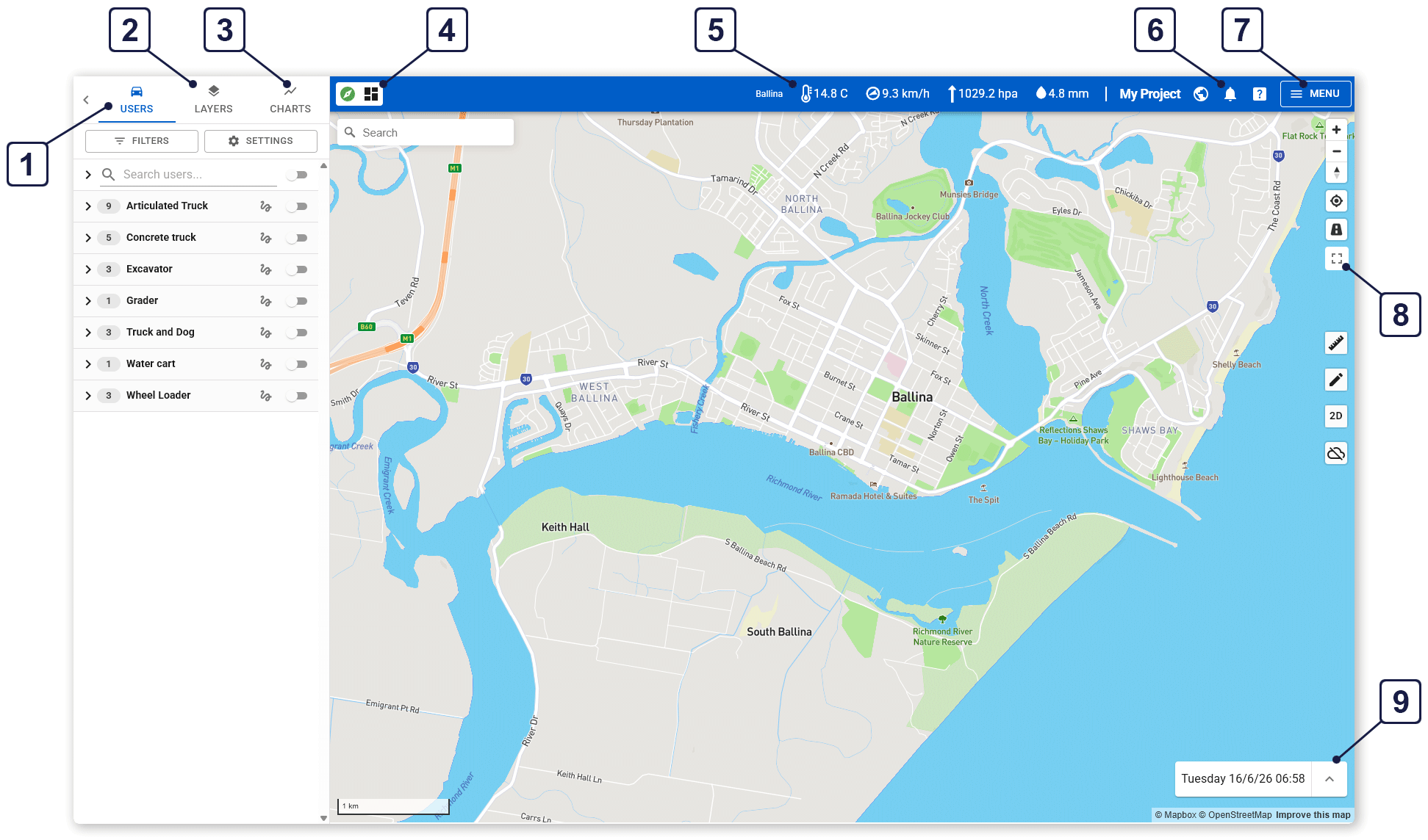
| 1 | The Users tab is used to locate specific users or equipment on the map. See The Users Tab section below. |
| 2 | The Layers tab is used to control the layers of information shown on the map. See The Layers Tab section below. |
| 3 | The Charts tab is used to configure and display graphical charts over the map. See The Charts Tab section below. |
| 4 | The Saved Settings panel is used to load custom map layout showing charts and dashboards, to edit these layouts, and to return the map to its default layout (with no charts). See The Charts Tab section below. |
| 5 | Displays weather conditions at the project location using rain radar. See The Map Controls section below. |
| 6 | Click the bell icon to open the release notes in a pop-up window, or click the question mark to search through the help center. |
| 7 | Open the menu to change to different pages in Virtual Superintendent. Refer to the Using the Virtual Superintendent Main Menu help article. |
| 8 | Use the map controls to change the map view and to open map tools. See The Map Controls section below. |
| 9 | Opens the Timeline panel where you can replay historical site activities such as user and plant movements and weather conditions. See The Timeline Panel section below. |
The Map Controls
Each icon on the menu bar represents a specific map-related tool or function:
| Button | Name | Description |
|
|
Zoom In |
Zoom into the map (viewed from closer). You can also zoom into the map by rolling your mouse scroll-wheel forward over the map. |
|
|
Zoom Out |
Zoom out of the map (viewed from farther away). You can also zoom out by rolling your mouse scroll-wheel back over the map. |
|
|
Map Bearing |
Reorients the map bearing so North is pointing up. |
|
|
My Location |
Pan and zoom the map to your current location, based on your browser location. |
|
|
Traffic |
Toggles the traffic layer on and off. |
|
|
Fullscreen |
Toggles the map between normal and full screen. |
|
|
Measuring Tool |
Opens the measuring tool. See the Using the Measuring Tool section below. |
|
|
Edit Geometries |
Create or edit a map geometry. See the Creating Map Geometries section below. |
|
|
Map View |
Toggles between 2D and 3D terrain view. In 3D view, right-drag the map to change the map pitch. See the 2D and 3D Settings section below. |
|
|
Rain Radar |
Toggles the rain radar layer on and off. See the Displaying Rain Radar section below. |


Map Search Bar
Use the search bar located in the top-left corner of the map to search for a particular street address or location.
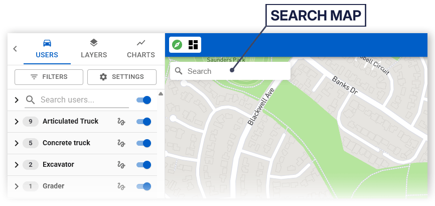
Geographic suggestions that match your text are shown as you type. Select a location to pan and zoom the map to that location.
2D and 3D Settings
The map supports both 2D and 3D views:
-
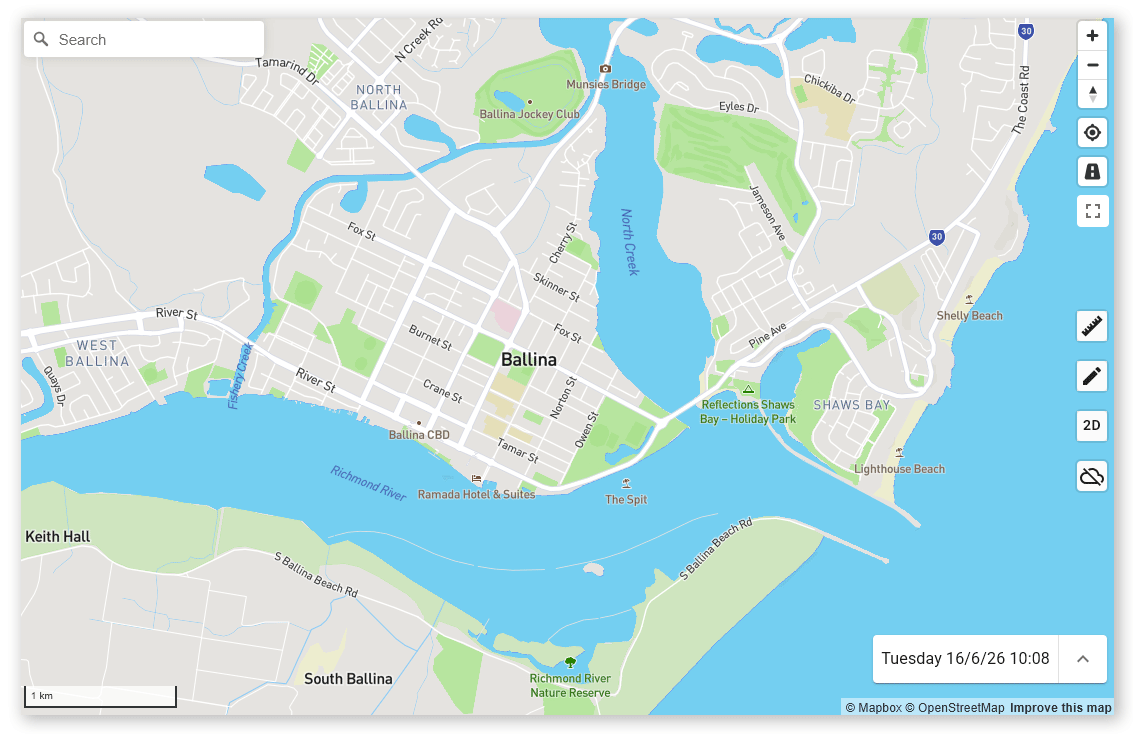
2D View displays the map in a flat, top-down format
 Click or tap to expand image
 -
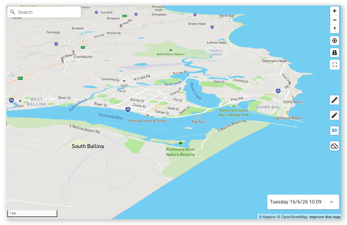
3D View displays the map in three dimensions, allowing you to visualize terrain and elevation
 Click or tap to expand image
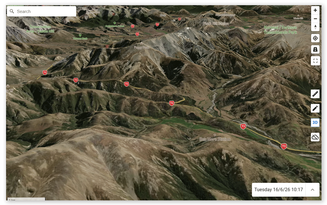
Note: The 3D map view might cause slower map rendering.
To rotate the map. or adjust the map pitch (changing the upward or downward tilt of the virtual camera view and the position of the horizon) right-click and drag your mouse over the map.
Using the Measuring Tool
The Measuring tool is used to display the distance between points on the map, or the area of a defined map geometry.
To measure distances between map points:
-
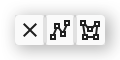
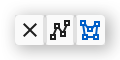
Click the Measurement icon on the map toolbar. A contextual menu opens.
-
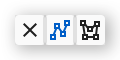
Click the Measure Distance icon (the center icon). The icon turns blue.
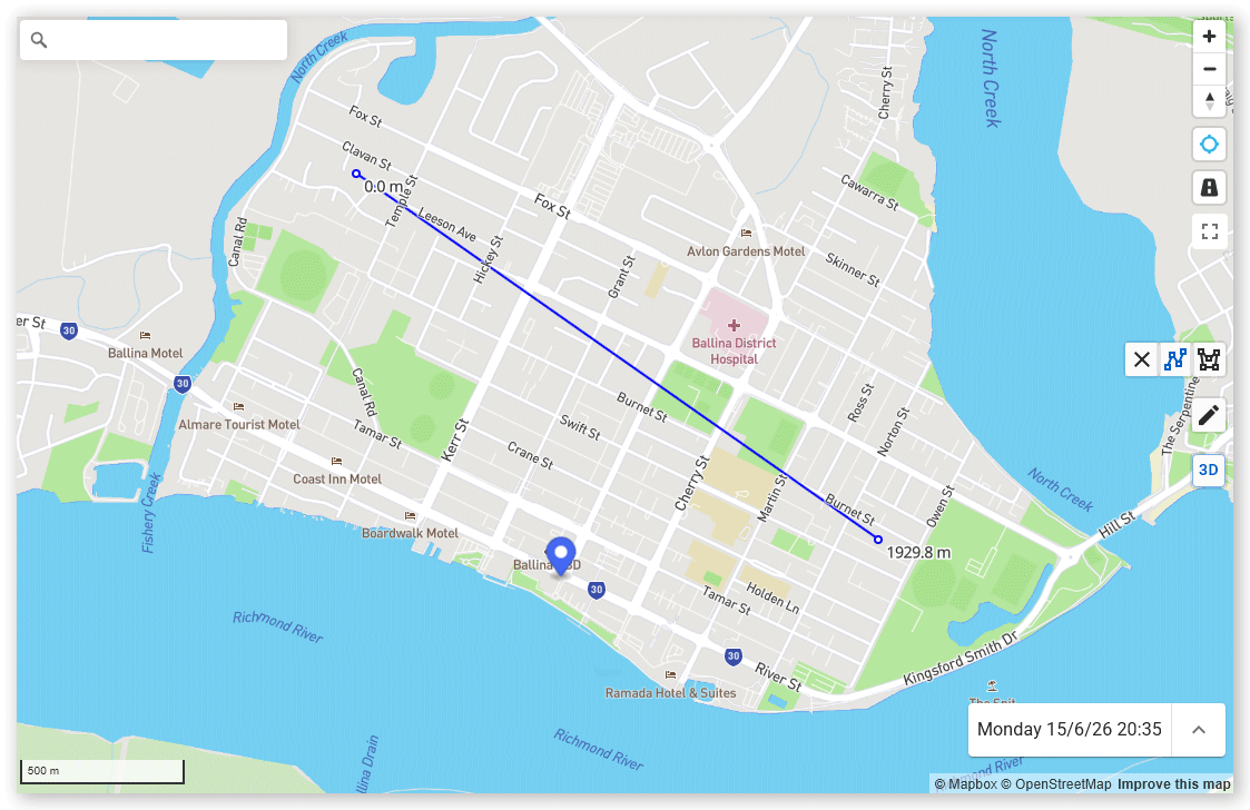
- Click the first location on the map. A blue dot is added to the map.
-
Click the second location on the map. A blue line is drawn between the two points, and a label beside the second distance displays the distance between the two points. Continue clicking to extend the line as required. At the vertices of each line segment, the distance of the line at that point from the start point is shown.
 Click or tap to expand image
To measure the area of free-form geometry on the map:
-
Click the Measurement icon on the map toolbar. A contextual menu opens.
-
Click the Measure Area icon (the right icon). The icon turns blue.
- Click the first location on the map. A blue dot is added to the map.
- Click more locations on the map to define the boundary of the geometry.
-
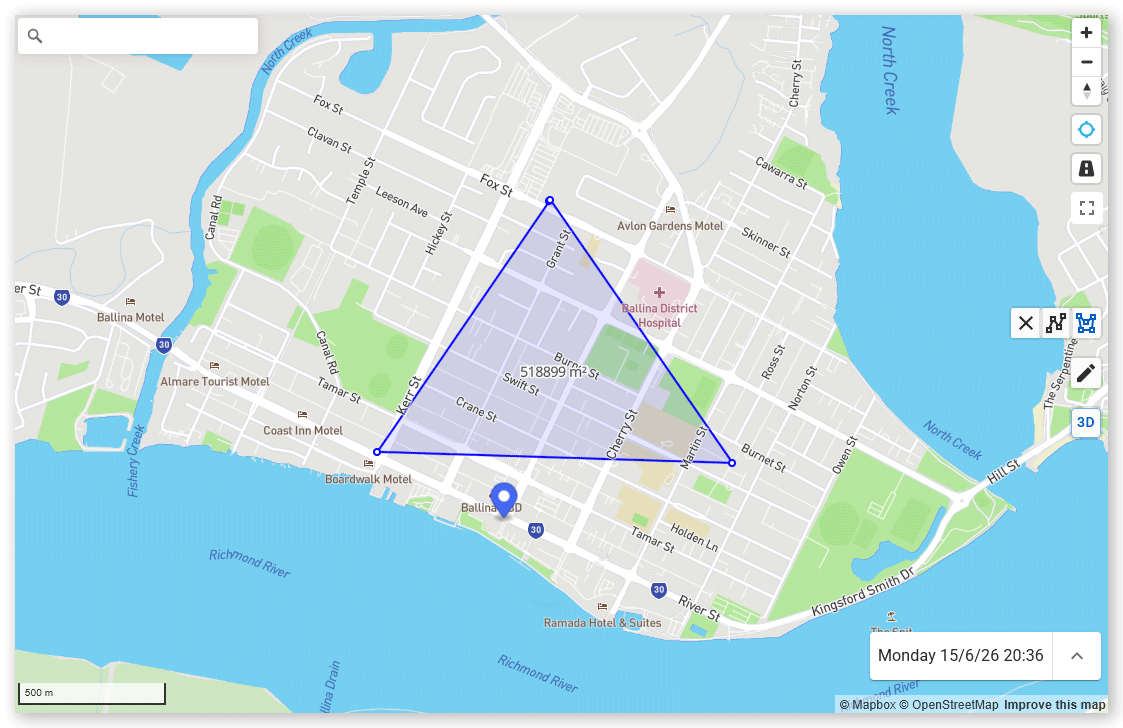
Double-click the final location to complete the geometry. The geometry turns blue and a label is shown at its center showing the area of the polygon.
 Click or tap to expand image
Displaying Rain Radar
The Rain Radar tool allows you to view current or historical rain data on the map.
To enable rain radar:
- Click the Rain Radar icon on the map toolbar. The icon turns red or green.
- If the icon is red, zoom out of the map until the icon turns red.
To use the Timeline panel to view historical weather:
- Open the Timeline panel by clicking the upward-facing arrow in the bottom-right corner of the map.
- Set the Period start and Period end date and time or select Live to view current data.
- Adjust the playback speed under the Speed dropdown.
- Click the Rain Radar icon on the map toolbar to enable the radar map layer.
- Press Play.
Note: Historical weather data is only available for the past 7 days.
Creating Map Geometries
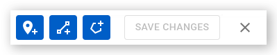
Geometries allow you to define points, lines, and polygons on the map. To create a geometry on the map, click the Edit Geometries (pen) map control to open the editor panel, then select from the three geometry types available:
- Marker (left)
- Line (center)
- Polygon (right)
Create Points
A point, or marker, is a single point on the map used to represent a geographic feature or point of interest.
To create a point:
- Click the Edit Geometries icon on the map toolbar to open the editor panel.
- Click the Add Marker icon.
- Click a point location on the map. The Add New Point dialog opens.
- Enter a name and description of the point.
- Click OK.
- Click Save Changes. The marker is added to the map. Click the marker to view its name and description.
Create Lines
A line exists between two points on the map and is used to represent a geographic boundary or path.
To create a line:
- Click the Edit Geometries icon on the map toolbar to open the editor panel.
- Click the Draw Line icon.
- Click a point location on the map. A dotted line connects the first point to the mouse cursor.
- Click the second location and repeat as often as needed.
- Double-click the final location. The Add New Line dialog opens.
- Enter a name and description of the line.
- Click OK.
- Click Save Changes. The line is added to the map. Click the line to view its name and description.
Create Polygon
A polygon, or geofence, is a closed geometry representing the boundaries surrounding a physical area, such as a work site.
To create a polygon:
- Click the Edit Geometries icon on the map toolbar to open the editor panel.
- Click the Draw Polygon icon.
- Click the first location on the map. A dotted line connects the first point to the mouse cursor.
- Click a second location and repeat as often as needed to create a map geometry surrounding an area.
- Double-click the final boundary location. The Add New Polygon dialog opens.
- Enter a name and description of the geofence and any additional details needed such as its active date range, approvals (if a disposal site), speed limit, and whether it is selectable in dockets.
- Click OK.
- Click Save Changes. The geofence is added to the map. Click the geofence to view its name and details.
Tip: When adding or editing polygons, you can use the Location Supervisors dropdown on the Add New Polygon dialog to "lock" supervisors to a polygon. When users create or edit dockets in Virtual Superintendent or SafeSIte and select a supervisor who has been locked to a location, they can only select one of their locked polygon locations from Location dropdowns. If a supervisor has not been locked to any locations, then any location can be chosen. Note that this does not work for weighbridge dockets, and you can lock more than one supervisor to any location.
Once created, you can show or hide all points, lines and polygons, or specific geometries, by toggling the User Defined Areas on or off from the Layers tab.
You can also use the Filters field to search for geometries by name and click the Show on map button to center the map on that geometry.
Note: You can also archive, duplicate or export geometries in KML (Keyhole Markup Language) format from the editor panel, or by expanding the User Defined Areas on the Layers tab until you locate the geometry, then clicking the three-dot menu and selecting Archive, Export as KML or Duplicate.
The Timeline Panel
The Timeline panel allows you to replay map data over a selected time period at adjustable speeds (to watch events over extended periods of time more quickly).

To use the Timeline:
- Enable or disable plant and people to control what is displayed on the map during the Timeline replay using the Users tab and selecting users and equipment.
- Click the expanding (upward-facing) arrow in the bottom right-hand corner of the map. The Timeline panel opens.
- Click the date and time under the Period start field. The calendar tool opens.
- Choose a start date and time, then click OK.
- Click the date and time under the Period end field. The calendar tool opens.
- Set an end date and time, then click OK.
- Open the Speed dropdown menu and select a playback speed. You can choose anywhere from x5 to x1000.
- Click the Play button. Events and activities are replayed on the map for the selected time at the specified speed. Drag to blue toggle left or right along the playback slider to replay specific areas or to jump forward or back within the specified timeline period or use the fast forward and rewind buttons.
Note: Click the Live button at any time to return to real-time data. The button turns blue when live mode is active.
The Users Tab
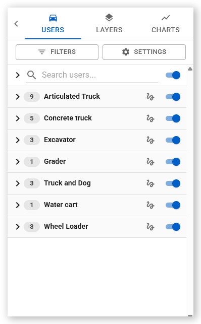
There are two ways to filter this information:
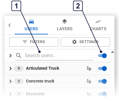
| 1 | Use the Search Users filter to search for a specific person or plant by typing their name into the field. Click the icon beside their name to automatically center the map on their location. |
| 2 | Use the View All toggle at the top of the panel to show or hide all users currently signed in. |
Settings
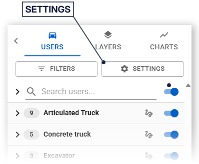
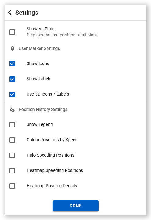
| Setting | Description |
| Show All Plant |
Displays the last known position of all plant equipment, including those not currently online. Use to quickly locate equipment and to assess plant availability for hire to nearby projects.
|
| Show Icons |
Displays icons representing plant equipment and personnel on the map. Each icon represents a specific Plant or Labor type.
|
| Show Labels |
Displays labels beneath each icon representing plant equipment and personnel on the map. The color of the dot under the icon indicates how recently a position was recorded by the user or equipment (green = less than 10 minutes ago, orange = 10-30 minutes, red = 30-60 minutes, grey = more than 60 minutes ago).
|
| Use 3D Icons / Labels |
Displays icons in 3D with optional supplier-based color-coded labels.
|
| Show Legend |
Displays the map legend in the upper-left corner of the map. Use the legend as a reference for interpreting icons and data.
|
| Show Trail |
Displays the last 30 minutes of movement for the selected users. Can be enabled per user or for all users. Use the Timeline panel on the map for up to 24 hours of data.
|
| Color Positions by Speed |
Colors trail points on the map based on the recorded speed of the equipment or user. Click a point on the map to see more details in a pop-up window. Open the map legend (Show Legend) to see the speeds represented by each color.
|
| Halo Speeding Positions |
Highlights locations where speeding events occurred with a secondary ring.
|
| Heatmap Speeding Positions |
Displays a density heatmap of areas where speeding events were recorded on the map (yellow = low, red = high).
|
| Heatmap Position Density |
Shows areas of high and low activity (blue = low density, red = high). Use to identify areas of congestion, heavy work or slow movement on site.
|
The Layers Tab
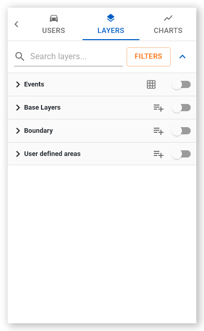
- Map layers are used to show additional visual information above the base map layer. This might be satellite or drone imagery, elevation (Digital Elevation/Terrain or DEM) data, and weather radar covering a wide area, or restricted to smaller areas, such as traffic density. Depending on the layer type, several layers might be stackable on top of one another, and each remain visible (for example, a weather layer on top of a traffic layer on top of a satellite layer).
- An event is any type of activity recorded by Virtual Superintendent, the SafeSIte app or monitored plant equipment, including sign-ons, sign-offs, breaks starting and ending, loads dumped or collected, and vehicles or users speeding.
- A geometry is a point, line or geofence polygon. These are used to identify points of interest, paths, and areas. Typically, each site is drawn within a geometry that becomes a geofence determining its physical boundaries. This geofence can then be used to track vehicles and users entering or exiting the site, and to monitor activities within the geofence.
Events
Expand the Events menu option to see the various event types available for display on the map:
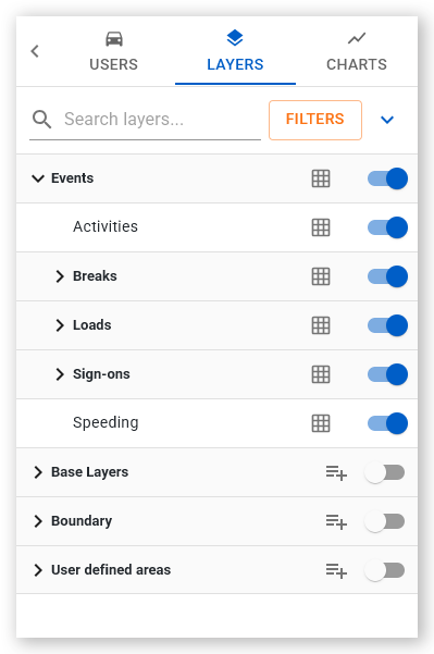
Choose from:
- Activities
- Breaks (Break Started and Break Completed)
- Loads (Loaded and Dumped)
- Sign-ons (User, Operator and Plant Sign-on and Sign-off)
- Speeding
When enabled, these display events from the last 30 minutes as simple text labels on the map indicating the event type and count using icon color, letters or numbers depending on the map zoom level.
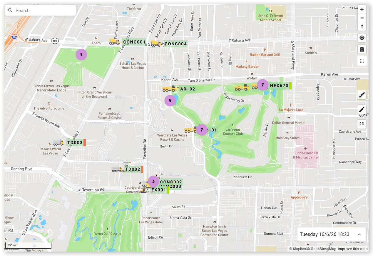
Click a label on the map to open a pop-up menu displaying more information about the events recorded.
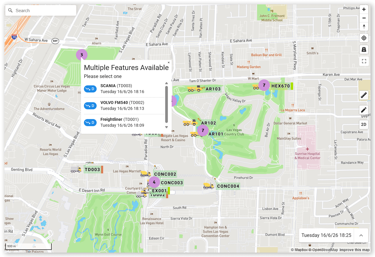
Note: To view older events, use the Timeline panel. See The Timeline Panel section above for more information.
Click the Grid icon beside an event toggle to view events as three-dimensional hexagonal icons on the map.
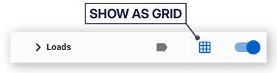
These hexagon icons visually indicate the number of events recorded using their height:
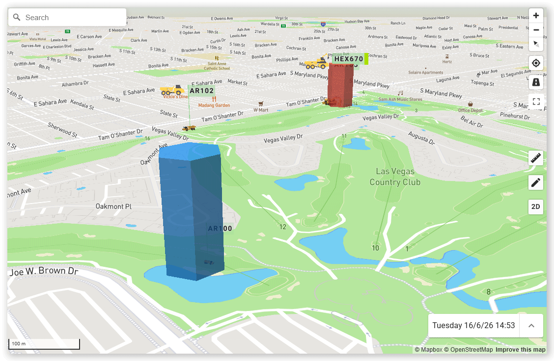
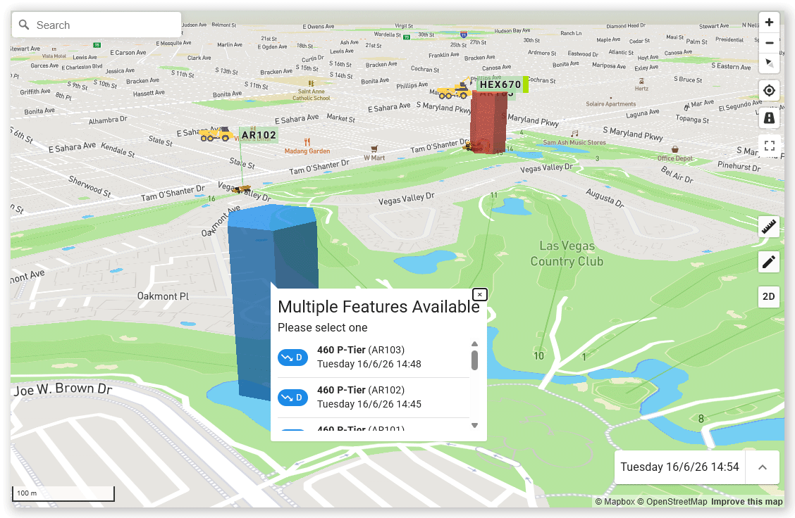
Like labels, click a hexagon icon to view more detailed event information. Some events (for example, Load/Dump) and locations with combinations of events, can also include linked data. Click these to drill down to more information.
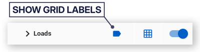
Click the Show grid labels button to the left of the Grid icon to show labels above the map hexagon:
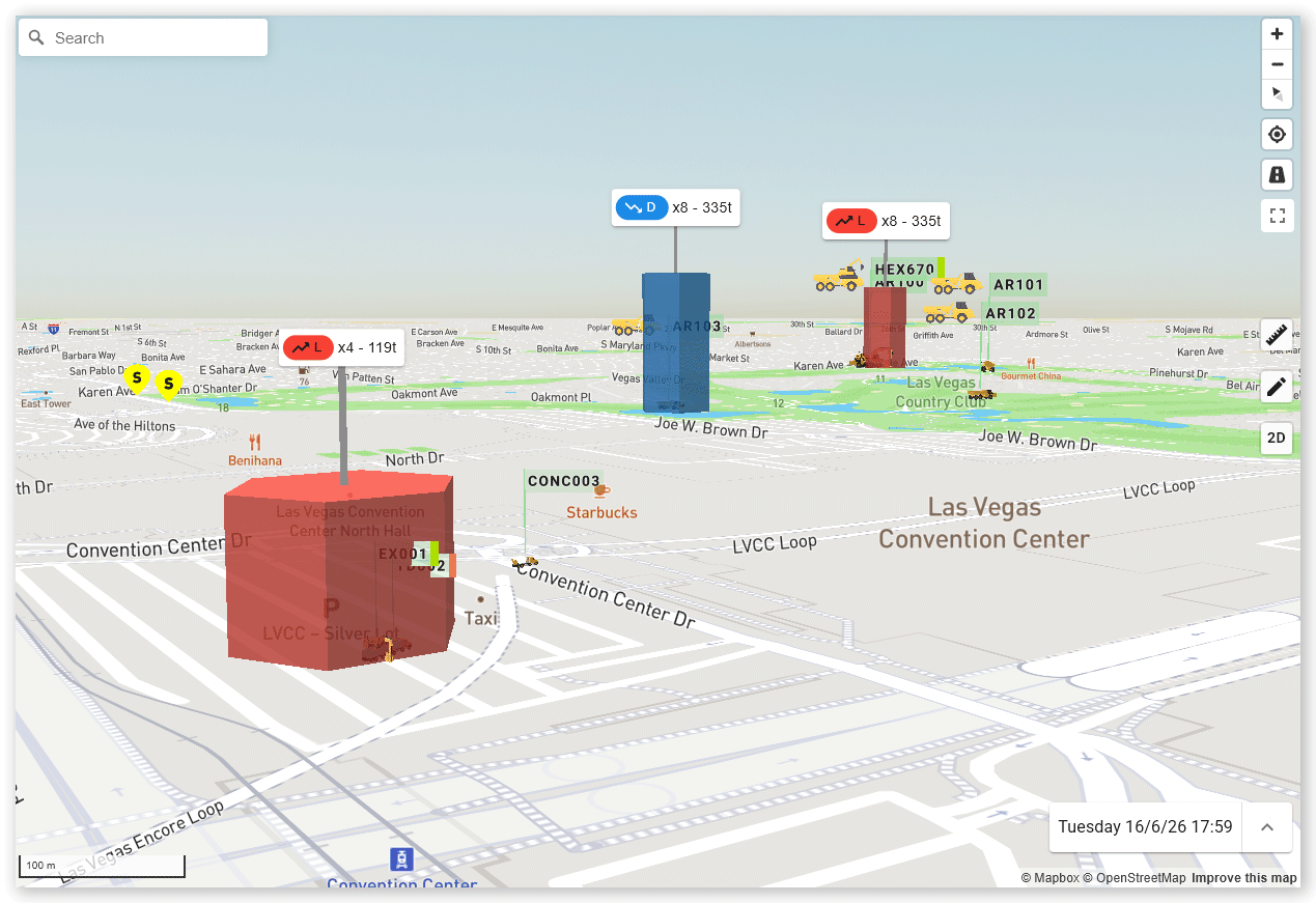
To return to the label view, click the blue Show grid labels icon again, or click the Grid icon.
Geofences
A geofence is a defined area used for tracking and reporting. To view geofences on the map expand the User defined areas menu option and then choose from:
- Other
- Cut
- Fill
- Waste
- Work area
You can further filter geofences by status by clicking the Filters button and choosing from:
- Active - These geofences trigger notifications when a user or vehicles crosses its boundary.
- Inactive - These geofences can be seen on the map by do not trigger notifications.
- Archived - These geofences are no longer shown on the map and must be reactivated to be used.
Click the boundary of a geofence on the map to open a pop-up menu displaying more information about the geometry.
Click the Zoom to Geofence icon in the menu to pan and zoom the map to the selected geofence.
The Charts Tab
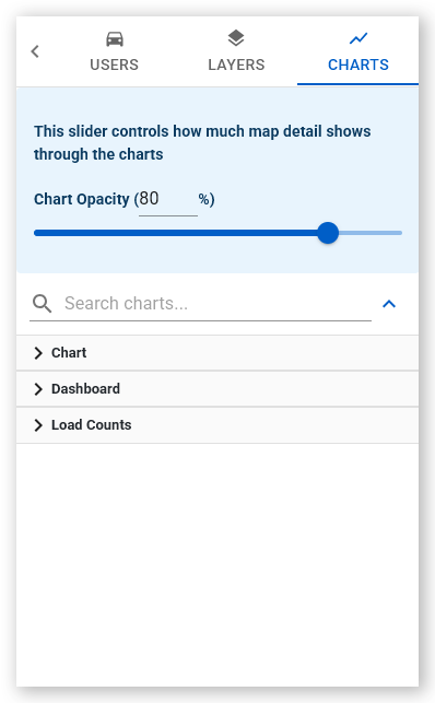
The chart layout types available on the map are divided into three categories:
- Chart - Single-question visualizations
- Dashboard - Multiple charts with a customized layout
- Load Counts - Real-time production data
Chart
A custom chart displays a single chart over your map and is designed to answer a single question about your project.
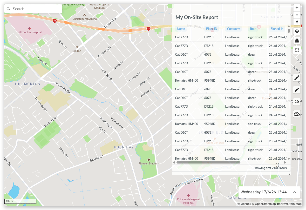
These charts update automatically as more data becomes available and must be configured for you by Virtual Superintendent support.
To display a preconfigured custom chart:
- Click the Charts tab.
- Expand Chart on the Charts menu tab and toggle on the chart you want to add to the map. The chart is added to the map.
To save the chart as a custom layout:
- Click the Charts tab.
- Expand Chart on the Charts menu tab and toggle on the chart you want to add to the map. The chart is added to the map.
- Click the Edit button.
- Set the opacity of your chart using the Chart Opacity slider at the top of the Charts tab.
- Click Save Changes to save your chart layout.
Note: You can save both custom charts and dashboard charts in your saved layout. Only dashboard panels can be repositioned.
Dashboard
A custom dashboard is one made up of chart panels of your choice, positioned on the map where you want them, and with a specified opacity level.
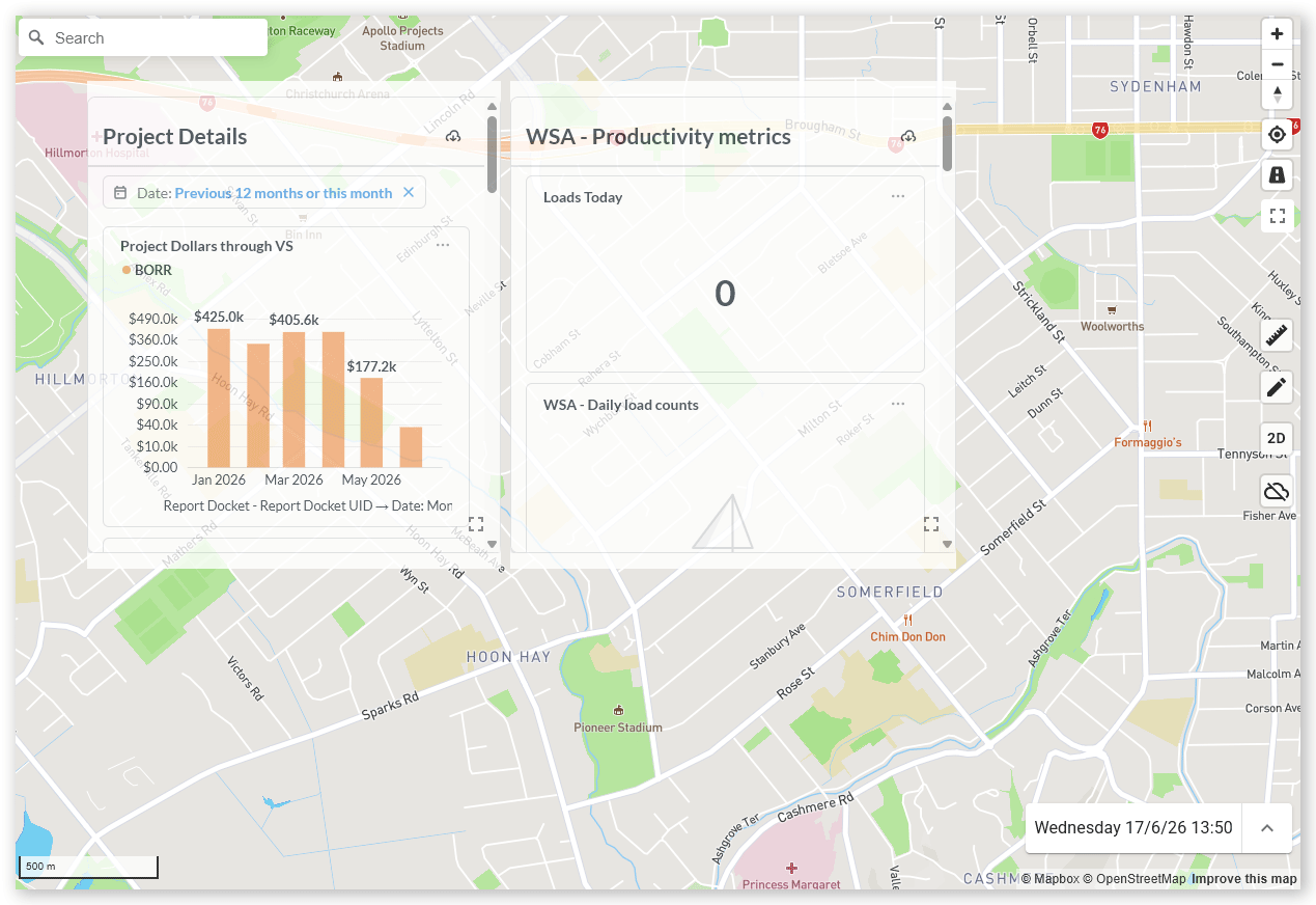
These charts update automatically as more data becomes available and must be configured for you by Virtual Superintendent support.
To create and save a custom dashboard layout:
- Click the Charts tab.
-
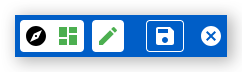
Click the Switch to Saved Layout button in the chart layout menu in the top-left corner of the map. The menu bar expands, adding the Edit, Save and Cancel buttons.
 Click or tap to expand image
 - Expand Dashboards on the Charts menu tab and toggle on the charts you want to add to your dashboard. The charts are added to the map.
-
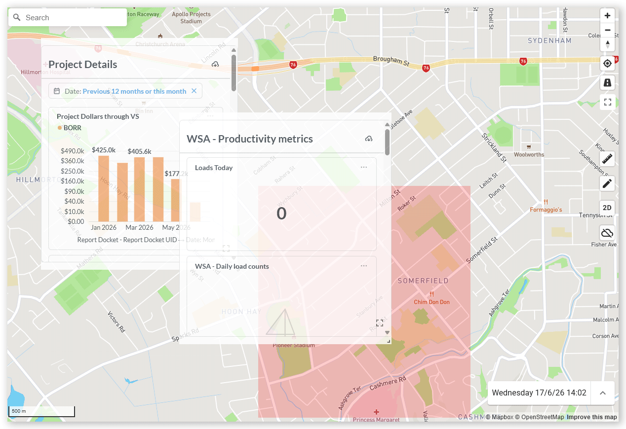
Click the Edit button and rearrange the chart panels on the map. To move a panel, begin dragging any corner. The background behind the panel turns red. Drag the panel to the required map location and then release it. The chart panels must stay within map boundaries and cannot overlap other charts.
 Click or tap to expand image
 -
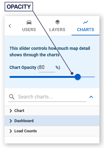
Set the opacity of your charts using the Chart Opacity slider at the top of the Charts tab.
 Click or tap to expand image
 - Click Save to save your chart layout.
To recall a saved chart layout:
- Click the Switch to Saved Layout button. Your saved dashboard layout and opacity are loaded.
To return to the default chart layout (that is, no charts showing on the map):
- Click the Switch to Default Layout button.
Load Counts
Load counts charts display real-time volume and production data as visual charts overlaid on the map.
To view available Load Count reports and show them on the map:
- Click the Charts tab.
- Expand the Load Counts menu on the Charts tab and toggle on the chart you want to add to the map. The chart is added to the map.
Configure Load Count Reports
- Click Menu > All Reports. The Reports page opens.
- Locate your saved Load Count report.
- Click the three dots in the top-right corner.
- Select one of the following display options. These determine how the chart is displayed on maps.
- Fit to Report - Displays the full selected time range of the report
- Fit to Data - Displays only the available data within the selected time range
- Show/Hide Projection - Toggles the projection (forecast) line on or off