Create and View Load Count Reports
Load Count reports provide information about loading, hauling, dumping, and return activities recorded in your project.
Use Load Count reports to monitor production rates, analyze cycle performance, and track project costs.
In this article
Create a New Load Count Report
To create a new Load Count report:
- Sign in to Virtual Superintendent.
- Click Menu > All Reports. The All Reports page opens.
- Click Create New Report.
- Click Load Counts. The Create Load Counts Report page opens.
The report displays loading, hauling, dumping, return, and cycle information for each recorded load.
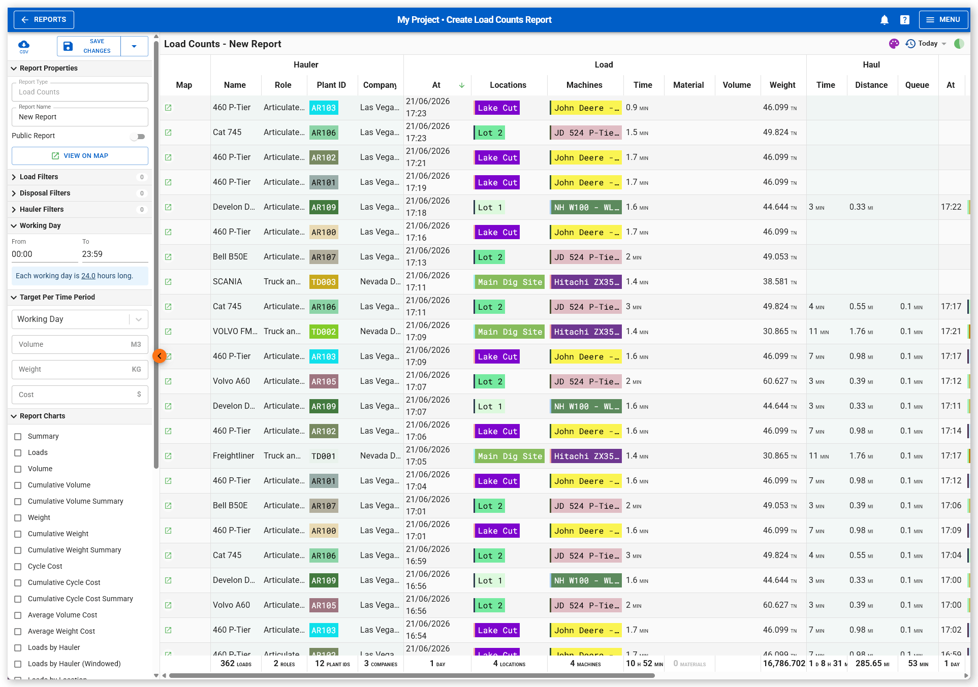
Understand Load Count Report Data
Load Count reports group information into the following columns:
| Section | Description |
| Hauler | Displays the hauler machine name, role, plant ID, and company. |
| Load | Displays the load time, load locations, loading machines, load duration, material type (if available), volume (if available), and weight (if available). Most loads contain either volume data or weight data, but not both. |
| Haul | Displays the haul duration, haul distance, and queue time before dumping. |
| Dump | Displays the dump time, dump location, associated dump machines, and dump duration. |
| Return | Displays the return start time, return distance, and queue time before the next load. |
| Cycle | Displays the total cycle time, total distance traveled, and cost per load. Cost per load is calculated using the hourly cost configured for onboarded hauler machines. |
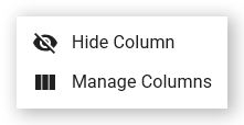
Manage column visibility
To show or hide columns you aren't interested in:
- Hover your mouse over a column group heading then click the three-dot menu. A contextual menu opens.
-
Click Manage Columns. The column selection dialog opens.
 Click or tap to expand image
 -
Toggle on or off individual columns.
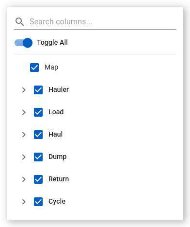 Click or tap to expand image
To hide individual columns:
- Hover your mouse over a column heading then click the three-dot menu. A contextual menu opens.
-
Click Hide Column. The column is removed from the report.
 Click or tap to expand image
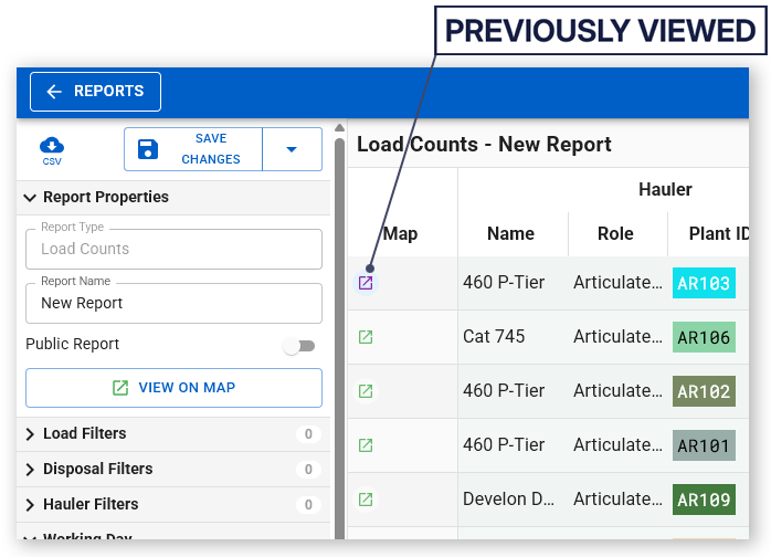
View a load on the map
To view a load on the map:
- Sign in to Virtual Superintendent.
- Click Menu > All Reports. The All Reports page opens.
- Locate and open a Load Count report.
- Click the green View Load on Map icon for a load. The Maps page opens.
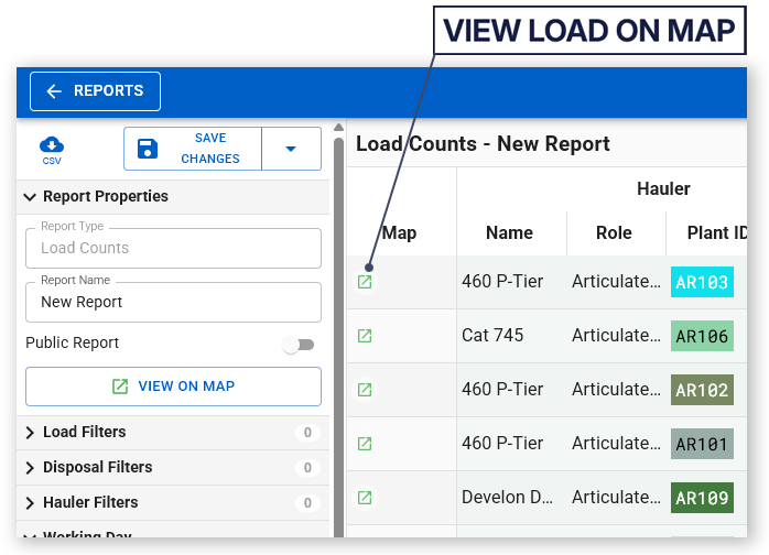
The selected load is displayed in the Timeline panel. You can replay the load and review machine movements, locations, and geofence activity.
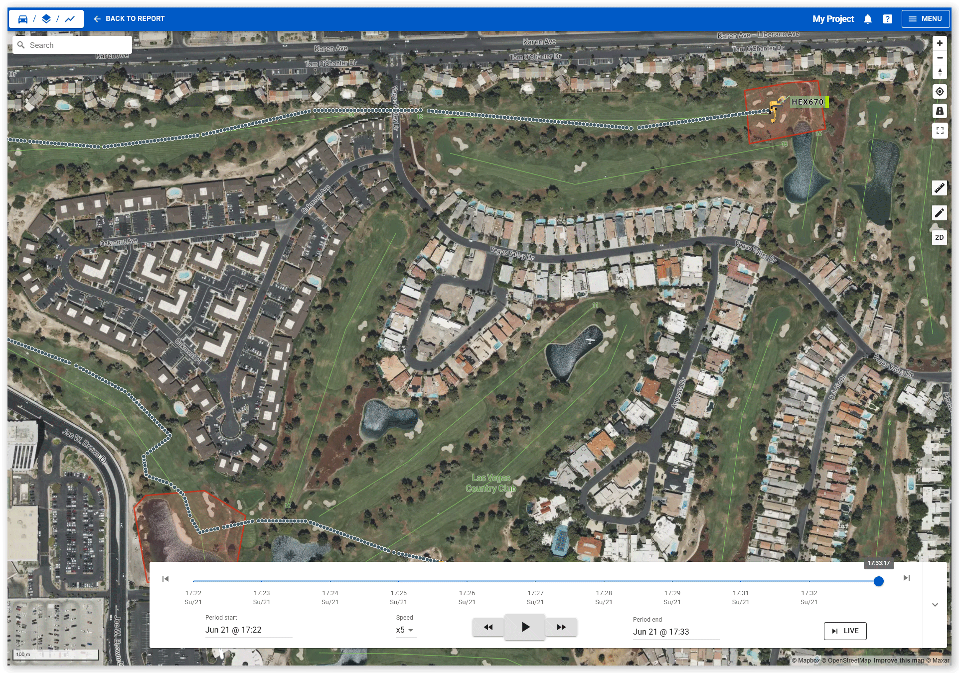
After viewing a load, the View Load on Map icon changes to purple to indicate that the load has previously been viewed.
Report Settings and Filters
Use the filter and settings panel on the left side of the report to control the data displayed.
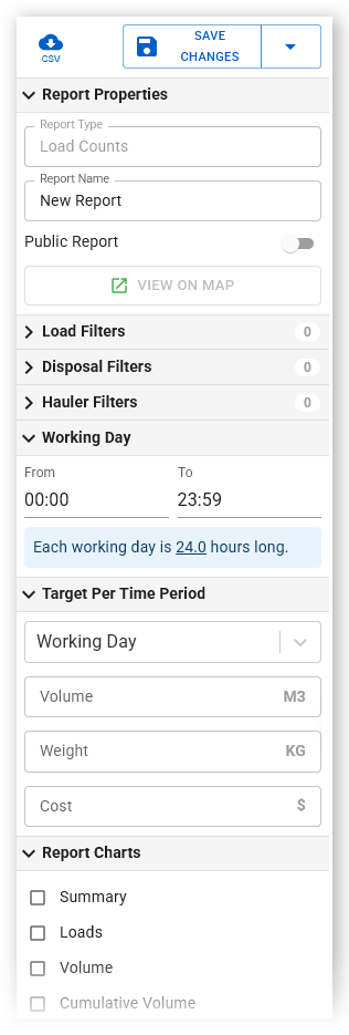
Report settings
| Setting | Description |
| Download Report | Downloads report data as a CSV file |
| Save Changes | Saves the report and current filter settings |
| Save As | Saves a copy of the report with the current filter settings |
| Discard Changes | Reverts the report configuration to its last saved state |
| Report Type | Specifies the report type (Load Counts). Read-only. |
| Report Name | Specifies the report name |
| Public Report | Controls whether the report is public (on) or private (off) |
| View on Map | Opens the Maps page and shows the details of each load in the Timeline panel. |
| Working Day | Use the From and To fields to define the normal start and end times of the working day. These values are used when calculating daily targets. |
| Target Per Time Period | Use this setting to define production targets for the report. For more information, see Work with Targets. |
Filters
The report supports the following filter groups:
| Filter group | Description |
| Load Filters | Filters by machines, load locations, and materials. By default, all three are selected. |
| Disposal Filters | Filters by dump locations and dump machines |
| Hauler Filters | Filters by company, operator, Plant ID, and role |
| Report Charts | Selects the charts displayed in the report |
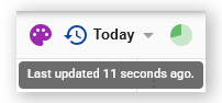
Report updates
The update icon (green animated circle) in the upper-right corner of the report indicates when the data was last refreshed. Hover over the icon to view the exact update time.
Work with Targets
Targets allow you to compare production against planned values.
Use the Target Per Time Period setting to configure targets for Volume, Weight and Cost.
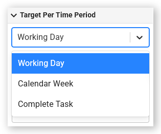
Targets can be measured against a Working Day, Calendar Week (Sunday to Sunday) or Complete Task (the entire duration of an operation, for example moving material from a specific Cut to a Fill, in the specified time).
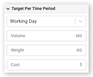
- Volume targets - Enter a value in the Volume field to define a volume target in cubic meters. Only loads with volume data are included.
- Weight targets - Enter a value in the Weight field to define a weight target in kilograms. Only loads with weight data are included.
- Cost targets - Enter a value in the Cost field to define a cost target in dollars. Cost targets are based on hauler machine costs and are displayed in cost-related charts. Cost targets do not include loading machines, dumping machines, or machine types other than haulers.
Note: When using Cost targets, configure hourly costs for each hauler on the Plant page to ensure accurate cost calculations.
Target projections
When using a Working Day target, Virtual Superintendent makes predictions based on the current day’s production performance:
- Predicted completion time (today) - Estimates when the target will be reached by using the average production rate achieved so far today.
- Required production rate - Calculates the rate needed for the remainder of the day to meet the target by the defined end-of-day time.
When using Calendar Week or Complete Task targets, Virtual Superintendent estimates the remaining hours required to reach the target based on the average production rate recorded to date.
A fixed completion date and time is not provided for these longer-term targets because production may not occur continuously (e.g., weekends, weather delays such as rain) which makes precise future time predictions unreliable.
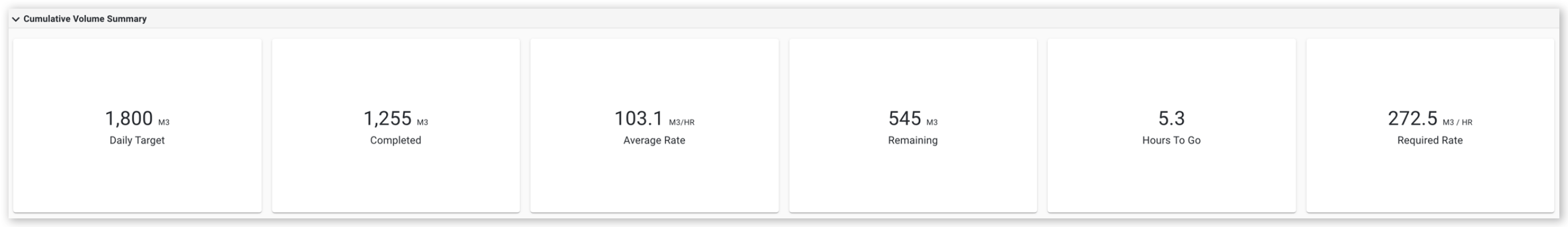
This graph shows the following information:
- A daily total volume target of 1800 cubic meters.
- Currently completed 1255 cubic meters.
- An average rate of 103.1 cubic meters per hour.
- A volume of 545 cubic meters required to complete the target (1800m3 - 1255m3).
- An estimated time of 5.3 hours remaining to complete the target (5.3hrs x 103.1m3).
- A required rate of 272.5 cubic meters per hour to meet the target volume. This value is only shown until your estimated finish time.
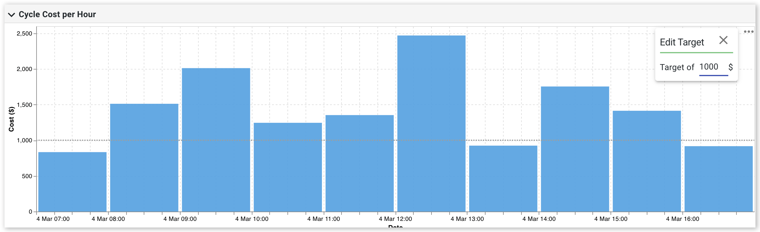
Chart-specific targets
The Cycle Cost, Average Weight Cost and Average Volume Cost charts allow you to define targets directly within the chart.
To edit a chart-specific target:
- Click the three-dot menu on the chart.
- Click Edit Target.
- Enter the required target value.
Set the Date Range
Load Count reports support relative and absolute date ranges.
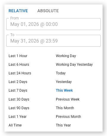
Relative date ranges
Relative reports are based on timeframe relative to the current date and time. Use relative date ranges for reports that you view regularly.
To set a relative date range:
-
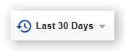
Click the current date range in the upper-tight corner. The date range selector panel opens.
 Click or tap to expand image
 -
Click Relative.
 Click or tap to expand image
 - Select a predefined date range. Examples include Today, This Week and the current Working Day.
Absolute date ranges
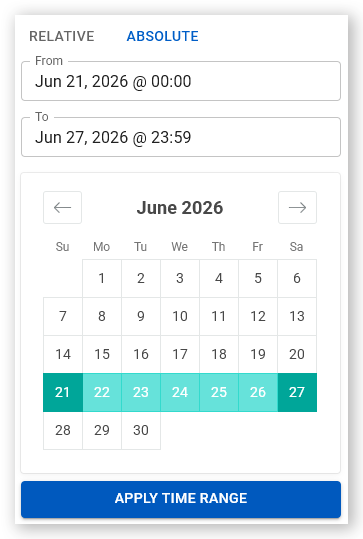
Use absolute date ranges for reports covering a specific period.
To set an absolute date range:
-
Click the current date range in the upper-tight corner. The date range selector panel opens.
Click or tap to expand image -
Click Absolute.
 Click or tap to expand image
 - Select a start date and end date on the calendar.
- Click Apply Time Range. The report updates.
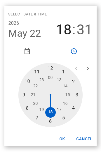
To specify a time range:
- Select the From or To time field. The Select Time & Date dialog opens.
-
Select the required time.
 Click or tap to expand image
 - Click OK. The report displays data only for the selected date and time range.
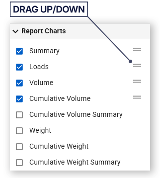
Arrange report charts
To change the chart order:
- Click and hold the drag handle next to a chart name.
-
Drag the chart to a new position.
 Click or tap to expand image
The charts are displayed in the new order.
Enable color coding
Color coding links chart data with the corresponding report rows.
To toggle color coding on or off:
-
Click the palette icon. The report and charts display matching colors for related data.
 Click or tap to expand image
Note: Charts enabled in Load Count reports are also available from the Charts tab on the Maps page, where they can be used in custom dashboards.